iOS App Design Templates
Designing iOS apps can be a rewarding yet challenging task—it involves not just creativity but also a keen eye for usability and detail. With diverse iPhone models and evolving design trends, using iOS app design templates has become an essential tool for developers and designers. This comprehensive guide explores these templates and offers insights into iPhone screen sizes, page layout, navigation, and UI elements. We’ll also delve into typography, icons, and other iOS design conventions, culminating in a resourceful summary to guide your app-building journey. Whether you’re an experienced developer or new to app design, this article will enhance your understanding of crafting visually appealing and functional iOS apps.
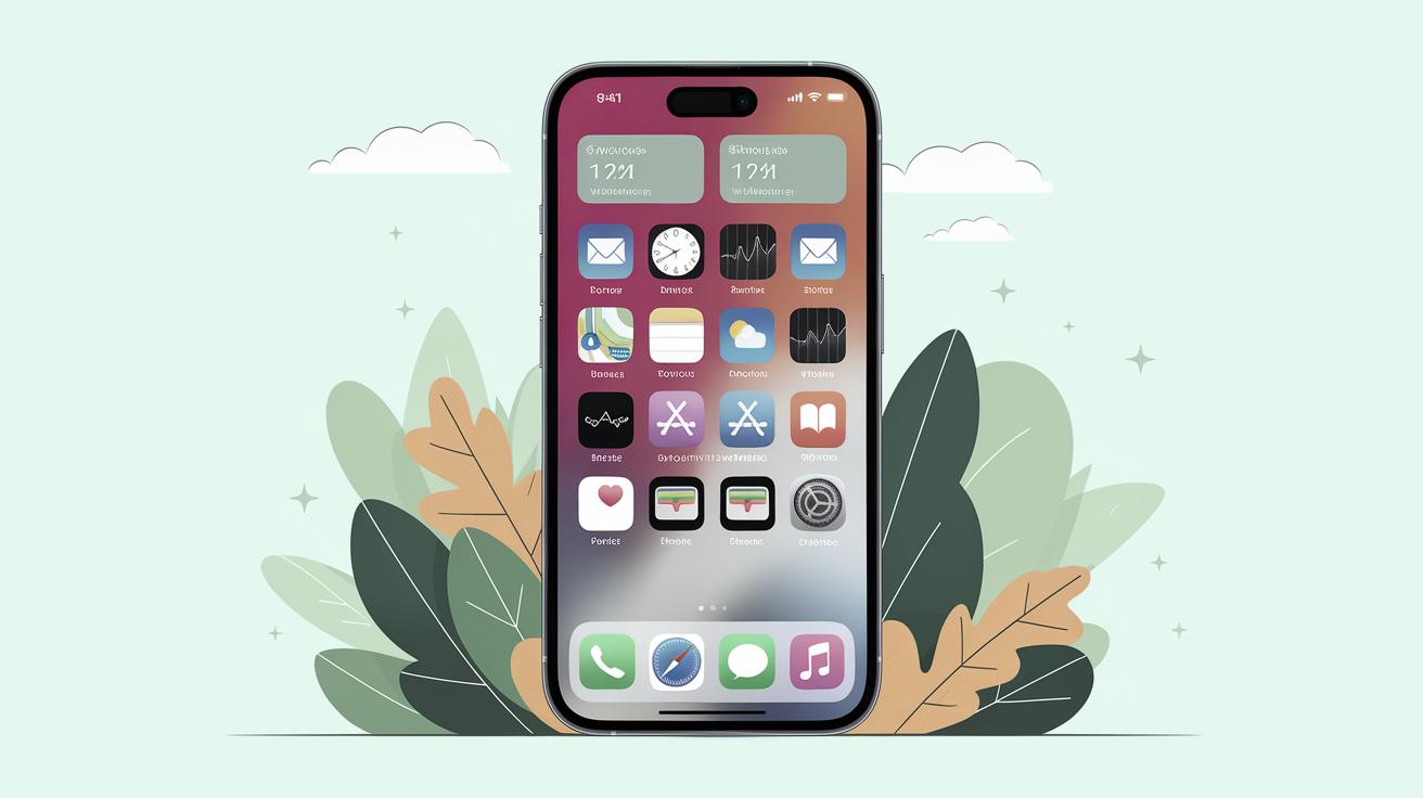
Happy Customers
Join thousands of satisfied customers making iOS apps using our templates globally.
Adopting iOS app design templates provides an efficient and streamlined approach to app development, offering increased productivity and consistent quality. Thousands of satisfied customers have found these templates instrumental in crafting unique and engaging iOS applications that stand out in a competitive market.
These templates offer a user-friendly experience, especially for beginners or smaller teams lacking extensive resources. With built-in design conventions and elements, developers can save time while ensuring their apps adhere to Apple’s strict usability standards, leading to faster releases and happier users globally.
iPhone Screen Sizes
What size frame should I use for iPhone design?
When designing for iPhone, recognizing the variety of screen sizes is crucial. Apple offers a range of devices, meaning designs should be adaptable to different dimensions to ensure a seamless user experience across all models. A general rule is to design using commonly used screen resolutions that account for the majority of iPhone users.
iOS Points vs. Pixels
Understanding the difference between iOS points and pixels is essential for developers. Points are used as the base unit for iOS design, which Apple uses to ensure consistent typography and elements regardless of screen size or resolution. This allows developers to scale visuals effectively while maintaining a consistent visual experience across various devices.
iPhone Page Layout
iOS Status Bar
The iOS status bar is a crucial element of the app interface, providing users with essential information like time, network strength, and battery status. Its presence or absence must be considered when designing layouts to ensure content visibility and readability. Developers often choose whether to display or hide the status bar based on the app’s purpose and screen real estate requirements.
iOS Nav Bar
The navigation bar serves as the backbone for iOS app navigation, offering users a clear path to navigate between different app screens. Typically positioned at the top of the screen, it often contains elements like title text and back buttons to guide user flow.
iOS Tab Bar
The tab bar presents a convenient way to switch between different app sections, often located at the bottom of the screen. This UI element allows users to access primary features or different app modes swiftly, enhancing the app’s usability by providing a clear visual indication of active and inactive sections.
iOS Home Indicator
Introduced with the iPhone X, the iOS home indicator has replaced the traditional home button. As a design consideration, it is important to ensure that it does not block key content or interfere with user interactions, requiring careful planning in the design phase.
Navigation in iOS Apps
Primary App Destinations
Primary app destinations represent the key functionalities of an app the user engages with most frequently. Designers should make primary destinations easily accessible through clear navigation pathways, ensuring users can easily access the app’s main features and services.
Navigating Back
Ensuring intuitive navigation is critical, and a robust “back” navigation strategy is key. In iOS apps, back navigation is usually facilitated by a swipe gesture or a designated back button in the nav bar, both of which should be consistently implemented to avoid user confusion.
iOS Search
Incorporating a search function enhances usability by enabling users to find content quickly. Effective search bars should be prominent and efficient, utilizing native capabilities like predictive text to improve user experience.
iOS Modal Sheets
Modal sheets provide additional functionality or information without overcrowding the main screen. These are often used for supplementary tasks like entering data or providing details, ensuring the main interface remains uncluttered and user-friendly.
UI Elements & Controls
iOS Lists (AKA “Table Views”)
iOS Lists, commonly known as table views, are a fundamental UI element for displaying data in a format easy to browse. Designers need to balance detail and simplicity, presenting information in a logical manner while maintaining a clean look.
iOS Buttons
Buttons are essential interactive elements used widely throughout iOS apps. They must be designed to be visually distinct and easy to tap, often using labels or icons to convey their function effectively.
Input Controls on iOS
Effective input controls are crucial for data entry and interaction within apps. Utilizing elements like text fields, toggles, and sliders can enhance user interaction, making input intuitive and accessible.
Pull-Down Menus
Pull-down menus offer a compact method for users to select options without needing to navigate away from the current screen, keeping the interface tidy while offering depth in usability.
Typography in iOS Apps
Title Text Styling for iPhone Apps
Title text in iOS apps often requires distinct styling to ensure it stands out as a key visual element. Utilizing Apple’s system font, San Francisco, can assure readability and aesthetic consistency across various devices.
Default Text Styling for iPhone Apps
Default text styling aims for legibility and clarity, often employing system fonts with user-adjustable dynamic type settings to cater to diverse audiences and accessibility standards.
Secondary Text Styling for iPhone Apps
Secondary text supplements primary content, usually smaller and in a lighter typeface. It can denote supplementary information or descriptions without drawing attention away from the main content.
Tertiary Text & Captions Styling for iPhone Apps
Tertiary text and captions are often used to label images or graphically complex elements, offering concise information to contextualize visual content.
Minimum Text Size on iPhone Apps
Adhering to minimum text size guidelines ensures legibility, especially considering varying screen sizes and resolutions. Guidelines are established to prevent user strain while reading text on smaller devices.
iOS App Icons
The iOS Superellipse (AKA “Squircle”) Icon Shape
The distinctive superellipse or “squircle” shape is characteristic of iOS app icons, providing both aesthetic appeal and a unified look. Designers must adhere to these shape guidelines to match Apple’s design philosophy and ensure visual consistency across the user interface.
Other iOS Conventions
iOS Tap Target Size
Minimum tap target size is a vital usability consideration, ensuring interactive elements are easily tappable. Adhering to guidelines for tap size enhances navigation and prevents user errors.
Dark Mode iOS Design Guidelines
Dark mode is a popular feature that reverses the color scheme for a darker appearance. Adapting app designs to support dark mode requires attention to contrast, colors, and readability, ensuring the app remains visually appealing and functional regardless of user preference.
Downloads
Many resources, including downloadable design templates, are available to aid developers and designers in creating iOS apps that are both functional and aesthetically pleasing. These resources can dramatically simplify the design process, enabling experimentation and rapid prototyping.
Further Resources for iPhone App Design
For those keen to delve deeper into iOS app design, numerous online courses, forums, and libraries provide comprehensive materials and community support. Engaging with these resources expands knowledge and offers insights into innovative design practices.
Wrapping It Up
One Final Note 😎.
Integrating design templates in iOS app development aligns creativity with usability, producing robust and visually compelling applications. Are you ready to make your app stand out?
| Sections | Key Points |
|---|---|
| Happy Customers | Thousands globally are using iOS templates for faster app development. |
| iPhone Screen Sizes | Consider device variations and use points for consistent design across models. |
| iPhone Page Layout | Essential elements include status bar, nav bar, tab bar, and home indicator. |
| Navigation in iOS Apps | Effective back navigation and a good search feature enhance usability. |
| UI Elements & Controls | Critical elements like lists, buttons, input controls, and menus build the interface. |
| Typography | Title, default, secondary, and tertiary text styles enhance readability & visual appeal. |
| iOS App Icons | Adhere to Apple’s superellipse shape for consistency. |
| Other iOS Conventions | Ensure tap target size is adequate and consider dark mode guidelines. |
| Downloads | Access design templates for streamlined app creation. |
| Further Resources | Numerous resources and communities can support and expand your design skills. |